Alright, so I haven't really talked much about my classes this semester. It's my last one, and I'm taking World Religions, Typography I, and Printmaking II.
So far I really enjoy Religion class, and I've learned a lot. I really need to look into what mediums Hindu and Buddhist art is done in.
Typography was scary at first, because I don't know much about Illustrator, but once I found the typography menu setting and got some advice from Samskee on the pathfinder tab and general advice from my professor, I'm starting to enjoy myself. Our
first assignment was just transforming letters into logos. At first I really wanted to incorporate a second letter in the designs, but luckily that so happened to be the
second project.
I'm still a little intimidated by what my classmates can do, but I suppose it's only fair. After all, if they were handed paint and a canvas they'd feel inadequate compared to fine art and illustration majors. I didn't really play much with trying to make images with the text, and my
wanted poster might have been slightly missing the point, but I realize that now and can improve on future projects.
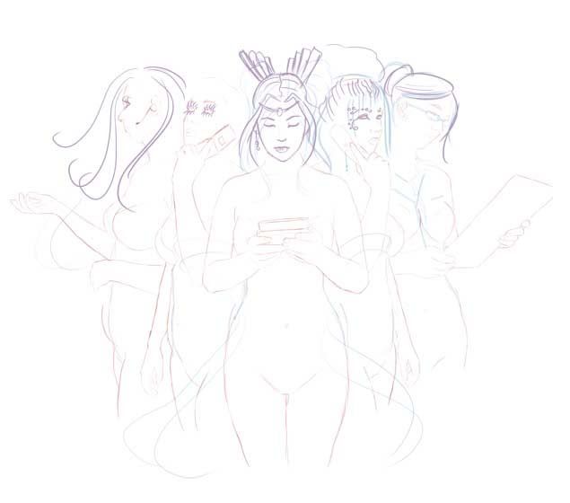
Our next assignment is a text portrait. I am considering Neil Gaiman, Death from Sandman, Batman, Catwoman, Crowley from Good Omens, or Spike from Buffy the Vampire Slayer. Neil has wonderful quotes, so that would be a great one to do. Death is awesome and of course the quotes come from Gaiman. I would feel bad using Jim Lee or Adam Hughes' art as a reference for my picture (why yes, I realize there are photos from the Batman movies, but admit it, none are as iconic as Lee or Hughes' work.) I'm really considering Crowley since I found a wonderful quote to use: "An Angel who did not so much Fall as Saunter Vaguely Downwards." When I was looking up reference pics, I came across Spike, and I've been wanting to draw him for a few weeks, so there's that. I'm really focused on either doing Death or Crowley though.
Printmaking II: oh how this is nothing like my first print class. I'll be honest, this isn't going well so far. I have really been holding off complaining, but I have to, at least a little. I traded my portfolio class for this because I thought I'd be able to do whatever subject matter I liked as I did in Print I. I wouldn't be so upset having specific assignments except I feel I'm not getting to develop my portfolio before I graduate. This scares me.
I've managed to work around it a little though so far. It isn't terrible, I'm just worried about not having a consistent subject matter. Our first assignment was a collagraph of a song, I chose Magdalena by A Perfect Circle. I made a
decent version of it on my computer (for printing out and transferring to the plate) but the final version was less than satisfactory. Everything that could go wrong did. Wrong color matboard, trouble tracing and cutting out shapes from the contact paper, glue not sticking, etc. We had to choose three different ways of using the same plate, but once my lace decided to fall off and my etched in lineart decided not to show up, I was left with a much-too-simplistic picture that could only be wiped as an intaglio. Also, trying to see if black ink is still on black mat-board is quite difficult. Needless to say, my final prints weren't quite as spectacular as I'd hoped. I do think I could use the techniques to make future projects that worked.
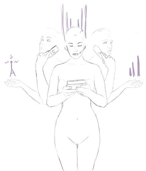
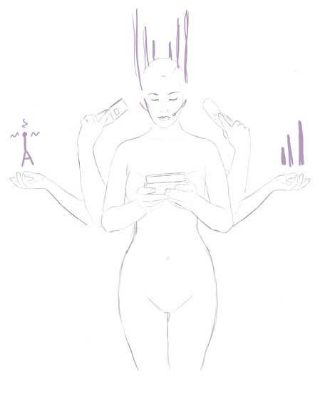
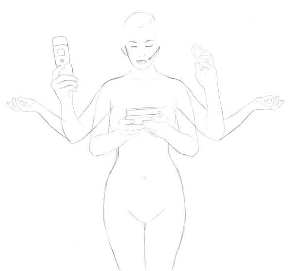
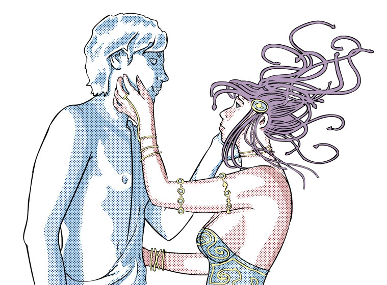
The second project was screenprinting... valentine cards, for a print exchange. We chose conversation hearts blindly, I picked "get real." Rather than go with a rejection picture, I thought of robot girls, mermaids, virtual women, etc. all trying to become human. My ideas started getting abstract after a while. After a full week of sketches (some of which will be used for other things) I talked with the professor about my struggle and he asked what I would have liked to do before there was an assignment. I said Carmilla, or maybe Medusa. That's how I ended up with
Frozen Love. I was really happy with it until I realized how difficult screenprinting was. First my arms were too short to pull the squeegee at the right angle/force, then my ink kept drying out. It was mostly the ink drying out. This is not a process that allows much time for problem solving. The first layer went on okay, the second took around 6 hours of failure. The third was going well until my hands refused to drag it at the right angle and things started drying out. So now that I've worked out the problems, I definitely want to do more.
The next two projects are a shaped woodcut and a colored intaglio. My class is petitioning to show at
Site:Lab on April 15th. We are doing a giant flip-book. We have teams: Salami,
Edward Zeus,
Spiders A-Team, and Plague Unicorns (Plauge for short.) Some of us are seriously discussing logos and t-shirts. This is totally random but totally awesome. The other assignment hasn't been demoed yet, but it's based on memories. I'd like to have an open assignment besides the final project but that's not going to happen.
So that's about it. I will post pics of the Valentine prints the next time I go to school to get them.